Once upon a time (seven years ago, to be exact…) we bought a house. Our first house. We still live here, and we’re finally starting to upgrade.
After all of our years of renting, I was so sick of white walls and neutral colors. We painted most of the rooms the house (still…seven years ago…) and were so excited to be living in color!
But, we ran out of funds to re-do the kitchen. We’re still looking for those funds…wait. They’ve been spent on other stuff like babies, surgeries, bathroom and bedroom remodels…(we’re planning a main bathroom remodel as soon as I’m all healed up from this blasted surgery…yay!)
I ramble. I am sorry.
Anyway, I love color, and we had a horribly awful, bland, OATMEAL kitchen. With hideous 80’s linoleum. That is still there. Ugh. Just ignore it. That’s what I do. Someday we’ll completely gut the kitchen and start over. Someday…
So, this is the oatmeal kitchen:
B.O.R.I.N.G.
The table and chairs are from our poor, starving, college student days. We broke two chairs through our moves over the years, so the Hubsters built us these awesome benches. They don’t really match, but they’re functional.
Also, I don’t love the bland-ness of the table, but I LOVE it’s shape and that gorgeous, curvy let. {insert sexy whistle here}
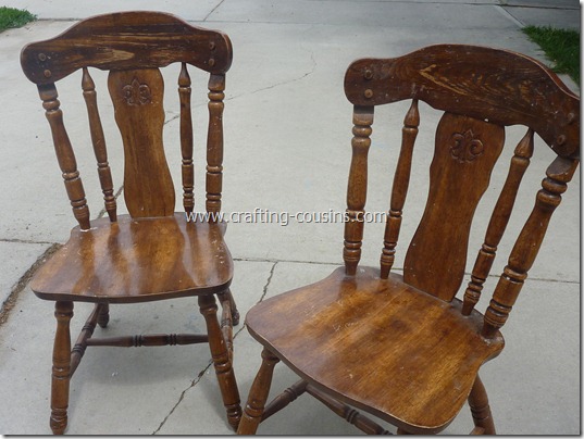
Then, one day, I found these little lovelies at the thrift store. For only FIVE BUCKS a piece. Um, hello! Yes. I bought them.
They also have nice curves, they’re solid wood, and they’re sturdy. They just not much to look at. Easy enough to fix. We sanded them down and painted them.
Hey, lovey! I likey the way you work that orbital sander! Woo, woo!
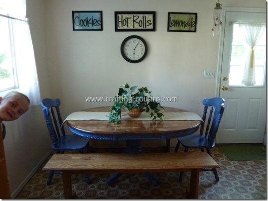
LOVE the way they turned out. I spray painted them (with Krylon Periwinkle) then glazed them to bring out those lovely curves. Gag. I hate my kitchen floor. Did I mention that yet?!
We sanded down, painted, and stained the table, too. Yay! The table and benches match!! I also made up some cute little kitchen signs with painted frames, scrapbook paper, and cardstock, painted my clock, and hung them on the wall.
Hello, there, Crocky! We all loved the way the kitchen turned out, and the whole makeover cost less than $20. Perfect.
Only…it wasn’t. Every time the back door shut, the pictures came crashing off the wall. Some of them shattered into millions of pieces. The plant on the table became a habitat for Lego guys and dinosaurs. The table runner was NEVER on the table. Firecracker.
It was time to re-think this whole design and find a way to make it more “wild boy” friendly.
So…
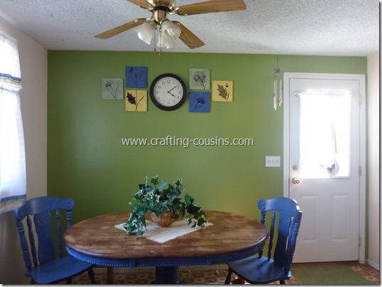
I painted an accent wall.
Made up some wood and vinyl artwork and nailed those suckers into the wall. The clock has an illegal amount of duct tape on the back of it. That should hold those bad boys into place when the back door is shut.
I added some strips of fabric (cut on the bias) to my ho-hum boring white curtains. I didn’t want to replace the curtains, because I love the natural light that the white curtains let in.
…and I LOVE my “new” dining room! (still hate that hideous flooring…someday…someday…patience, young grasshopper…)
This whole dining room makeover cost less than $60! Awesome!
Before:
After:
Not bad, eh? Oh, and in case you were wondering, that little centerpiece came off the table as soon as I was done snapping the picture. With all these boys, I think we just won’t mess with that! :)
Oh, and I am now accepting donations for the replacement of my flooring.
I kid… :)


Love the added color to the trim. Great color choice :).
ReplyDeleteMrs. Delightful
www.ourdelightfulhome.blogspot.com
Love the makeover! What color did you use on the wall?
ReplyDeleteI love the color blue and the color of green on the wall!! All the colors look soooo good together!! And I really like the new wall art!!
ReplyDeleteLove it! I'm a big periwinkle fan.
ReplyDelete